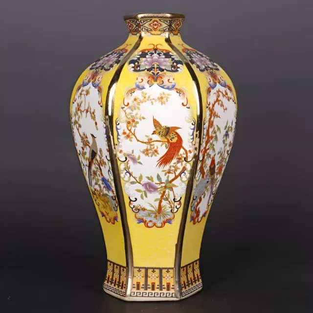
An antique-inspired ceramic vase can instantly add warmth, history, and balance to a living room—whether styled with fresh stems, dried botanicals, or displayed as a sculptural object on its own. The right shape, finish, and placement help a vase feel intentional: anchoring a mantel, softening sharp lines on shelving, or creating a refined focal point on a coffee table. For more guidance, see White Ceramic Decorative Vase Deco 79 – 8″ X 8″ X 16″ Centerpiece ….
Why Antique-Inspired Ceramic Vases Look Timeless
Antique-style ceramics have a quiet presence that reads collected rather than trendy. Even in a modern room, a well-chosen vase adds a sense of depth—like it has a story—without demanding attention from every other piece in the space. For further reading, see Vase Collection – The 16 best products compared.
- Ceramic surfaces diffuse light softly, creating a calm, high-end look compared with glossy metals or clear glass.
- Antique finishes (aged glaze, patina-like tones, distressed texture) add depth and character without overpowering the room.
- Traditional silhouettes pair well with modern furniture, making the piece easy to keep even as décor styles change.
- A single substantial vase can replace multiple small accessories, reducing visual clutter while keeping the space styled.
For a little design context, museum collections can be surprisingly helpful when comparing shapes and finishes over time—see the Victoria and Albert Museum ceramics collection and The Met’s Heilbrunn Timeline of Art History.
Where It Fits Best in the Living Room
Placement matters as much as the vase itself. The goal is to create a “reason” for the vase to be there—either by supporting the room’s architecture (like a mantel) or by balancing nearby shapes (like a lamp, mirror, or stacked books).
- Mantel styling: place slightly off-center and balance with a smaller object (candleholder or framed art) for a layered look.
- Console table entry view: use the vase as a vertical anchor beneath a mirror or artwork to guide the eye upward.
- Coffee table centerpiece: choose a low-to-medium height so it doesn’t block conversation; add a tray to define the vignette.
- Open shelving: let the vase act as a “resting point” between books and smaller décor, keeping negative space.
- Corner refresh: pair with a floor plant or tall lamp to fill dead space without adding bulky furniture.
At-a-Glance Styling Guide
Small styling choices can make an antique ceramic vase look elevated instead of random. Aim for a mix of intention (repeat colors, edit clutter) and softness (organic stems, gentle curves).
- Use odd-number groupings (1 or 3) for a more natural arrangement.
- Repeat a nearby color (pillow, rug, artwork) in the vase or stems to make the styling feel cohesive.
- Mix textures: ceramic + wood + linen reads warm and curated; ceramic + marble + metal reads crisp and formal.
Quick Pairings for an Antique Ceramic Vase
| Living room style |
Best vase finish |
Best stems/fill |
Placement tip |
| Modern neutral |
Matte ivory, sand, or warm gray |
Dried pampas, eucalyptus, bare branches |
Keep surrounding objects minimal; let the silhouette stand out |
| Classic traditional |
Crackle glaze, aged beige, antique white |
Roses, peonies, hydrangea (fresh or high-quality faux) |
Place near framed art or a mirror for a refined look |
| Boho eclectic |
Textured clay, distressed terracotta, mottled glaze |
Dried grasses, wildflower stems |
Layer with woven trays and books for depth |
| Industrial loft |
Weathered gray, charcoal, or mixed patina tones |
Tall branches, minimalist greenery |
Pair with black metal accents; keep lines clean |
| Coastal airy |
Soft white or pale blue-gray |
White florals, olive branches |
Add driftwood tones; avoid overly dark surrounding décor |
How to Choose the Right Vase (Size, Shape, and Finish)
Antique-inspired ceramics look best when scale and finish match the room’s “visual weight.” A delicate vase can disappear on a large console, while an oversized piece can feel crowded on a narrow shelf. Use these checkpoints to narrow the options quickly.
- Match height to surface: on a coffee table, favor lower profiles; on a console or mantel, a taller piece can create elegant verticality.
- Consider silhouette: rounded bodies feel soft and welcoming; narrow necks support structured bouquets; wide mouths work for loose, airy stems.
- Choose a finish that complements the room: warm patina tones suit wood and earthy palettes; cooler glazes pair well with marble, gray, and black accents.
- Think about function: if used with fresh flowers, ensure the opening accommodates a water-filled insert or stable arrangement; if decorative-only, dried stems stay low maintenance.
- Balance proportion: a vase should look intentional next to lamps, frames, and books—avoid a piece that looks “lost” or overly bulky for the surface.
A helpful rule of thumb for tabletops: if the vase will sit where people talk across it (coffee table, game table), prioritize width and shape over height. A lower, fuller silhouette keeps the arrangement present without becoming a visual divider.
Simple Arrangements That Look High-End
Care and Placement Tips for Ceramic Décor
FAQ
Can a ceramic vase be used for fresh flowers and water?
Yes, as long as the vase is water-safe. If you’re unsure whether the interior is fully glazed, use a watertight insert or place a small glass vessel inside the vase to protect the ceramic and nearby surfaces.
How tall should a vase be for a coffee table arrangement?
Aim for a low-to-medium height that won’t block sightlines across the table. Wider silhouettes with fewer, fuller stems usually feel balanced and conversation-friendly.
What colors look best with an antique-style ceramic vase in a living room?
Warm neutrals (ivory, beige, taupe), muted greens, and soft gray-blue tones pair especially well. For a cohesive look, repeat one nearby accent color from a pillow, rug, or artwork.
Recommended for you


Leave a comment