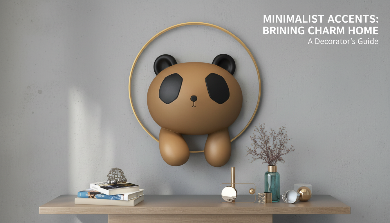
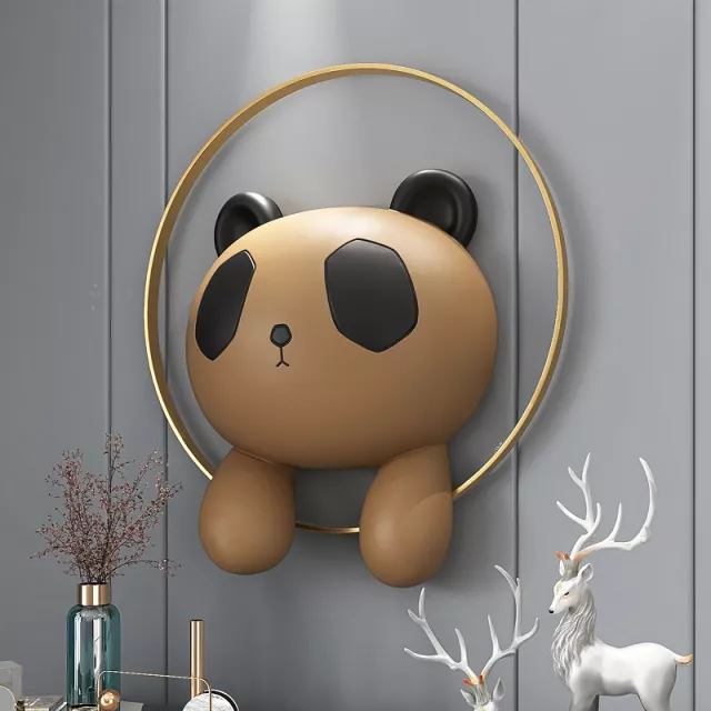
A panda motif paired with Nordic-style simplicity creates wall decor that feels both whimsical and refined. This sculpture style works well as a focal point in minimal interiors, kids’ rooms that still feel elevated, or as a conversation piece in an entryway. Below is a practical guide to styling, placement, pairing, and choosing the right size and finish for the space.
What Makes the Nordic Panda Look Distinct
The Nordic panda wall sculpture stands out because it delivers personality without visual noise. Instead of detailed, realistic fur textures and busy colors, the look leans into simplified shapes and clean edges—closer to modern Scandinavian design than themed nursery decor.
- Clean, simplified forms that fit Scandinavian-inspired interiors without looking busy
- Animal imagery that reads playful, but can still feel modern when paired with neutral palettes
- Works as a single statement piece or as part of a small wall gallery
- Pairs naturally with light woods, matte black accents, and soft textiles
The panda’s built-in contrast (light and dark) also makes it naturally “readable” from across the room. That’s useful in open-plan spaces where wall decor needs to hold its own at a distance without requiring lots of surrounding styling.
Where It Works Best at Home
Placement is what makes a panda sculpture feel intentional rather than random. Choose a wall where it can act like a punctuation mark—finishing the vignette instead of competing with it.
- Entryway: place at eye level above a slim console to anchor the first impression
- Living room: use as a focal point above a sideboard, reading nook, or near a plant corner
- Bedroom: position above a dresser rather than directly over the pillow area for a calmer feel
- Kids’ room or nursery: choose a spot visible from the doorway; keep mounting secure and out of reach
- Home office: balances minimalist desks with a warm, lighthearted accent
Placement guide by wall space
| Wall area |
Recommended placement |
Quick styling tip |
| Narrow wall column |
Center vertically, aligned with adjacent furniture edges |
Add one small framed print below to elongate the column |
| Above console or sideboard |
Bottom edge 6–10 in (15–25 cm) above furniture |
Repeat one color from the sculpture in a tray or vase |
| Gallery wall |
Treat as the “hero” piece, slightly off-center |
Keep surrounding frames thin and neutral |
| Over a bed |
Avoid directly above the pillow line; offset toward a dresser wall if possible |
Use soft lighting (sconce or lamp) to reduce shadows |
In busier rooms, give the sculpture breathing room. A panda silhouette looks best when it’s not fighting with a patterned wallpaper, a crowded shelf wall, or a TV wall full of reflective screens.
How to Choose the Right Size, Finish, and Style
Choosing well comes down to scale, finish, and how the piece behaves under your lighting. A little planning helps the sculpture look “placed” rather than floating.
- Measure the available wall width; aim for the sculpture to fill roughly 50–75% of the furniture width beneath it (if hanging above furniture)
- Pick a finish that matches existing hardware: matte black for modern contrast, light/neutral tones for airy Scandinavian rooms
- Decide on visual weight: bold contrast stands out on white walls; tone-on-tone looks calmer and more “built-in”
- Consider lighting: directional lighting can highlight texture; very glossy finishes show more glare
- Choose mounting based on wall type (drywall, plaster, brick) and expected weight; prioritize secure anchors
How to Choose (when you can’t decide in 60 seconds)
If you’re torn between two options, use a simple hierarchy: start with size, then finish, then styling details. Size is the hardest to “fix” after the fact, while finish and accessories can often be adjusted with nearby accents.
- Start with the wall’s function: entryways and living rooms can handle bolder contrast; bedrooms typically look better with softer, lower-contrast finishes.
- Match the room’s metal accents: if your room leans matte black (hardware, frames, lighting), a black or black-accented sculpture will feel cohesive.
- Test scale with painter’s tape: outline the sculpture’s approximate width/height on the wall to see if it feels undersized or overpowering.
- Plan for glare: if the wall gets strong daylight, consider a matte or satin finish to keep highlights from washing out the form.
Styling Ideas That Feel Intentional (Not Themed)
The goal is to let the panda read as modern decor with a friendly twist—not as a cartoon. Keep the surrounding items quiet and textural, and let the sculpture’s shape do the talking.
If you want a conversation starter in a shared space, a panda works because it’s universally recognizable. For a quick bit of context on why people are so drawn to them, the Smithsonian’s National Zoo offers a concise overview of giant panda facts.
Materials, Care, and Long-Term Upkeep
Lighting also affects how texture shows up day to day. If you’re adding a picture light, sconce, or directional bulb, basic lighting guidance from the U.S. Department of Energy is a helpful reference for understanding brightness and placement: The Lighting Handbook (U.S. Department of Energy).
FAQ
How high should a wall sculpture be hung?
Aim for eye level: the center of the sculpture is typically best around 57–60 inches (145–152 cm) from the floor. When hanging above furniture, leave about 6–10 inches (15–25 cm) of clearance so it feels connected to the piece below.
What’s the safest way to mount it on drywall?
Use wall anchors rated for the sculpture’s weight, and fasten into studs when possible for maximum security. Follow the included mounting instructions and re-check tightness after a couple of weeks as the wall settles.
Does it suit minimalist rooms without looking childish?
Yes—simplified Nordic forms and neutral finishes keep the look modern rather than cartoonish. Pair it with restrained colors, thin frames, and natural textures (linen, light wood, ceramics) to maintain a clean, elevated feel.
Recommended for you









Leave a comment